← Back
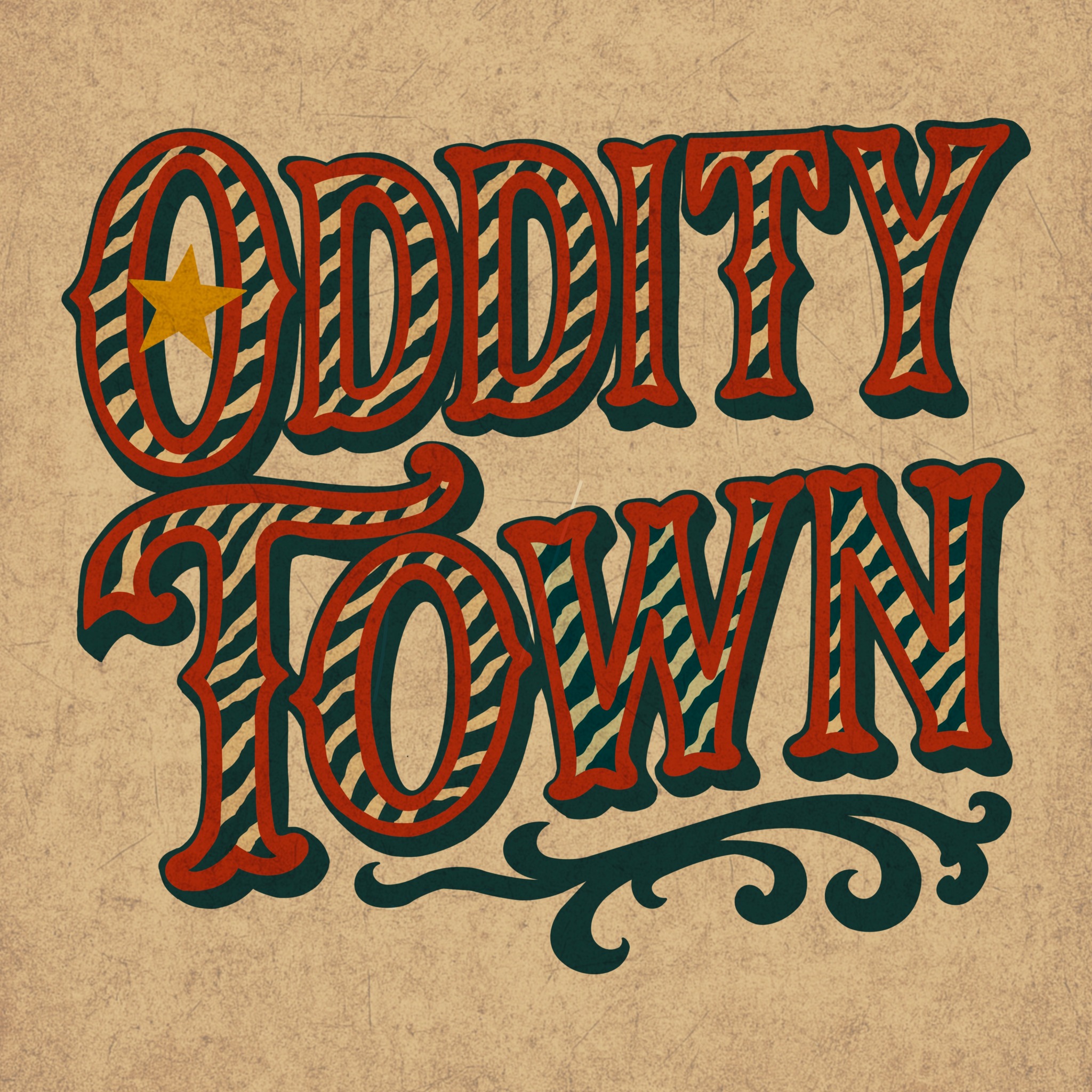
Oddity Town Logo (2025)
A bespoke logo created for Oddity Town, an independent art and oddities brand. The design draws on vintage circus typography and early 20th-century signage, pairing bold ornamental serifs with distressed textures to evoke nostalgia and theatrical curiosity.
The colour palette — deep crimson, faded teal, and muted gold — channels the warmth of aged posters and carnival banners, visually situating the brand within a world of eccentric collectibles and surreal charm.
Entirely hand-rendered before digital refinement, the lettering captures Oddity Town’s identity: a celebration of the strange, the beautiful, and the historically uncanny.
Post a comment